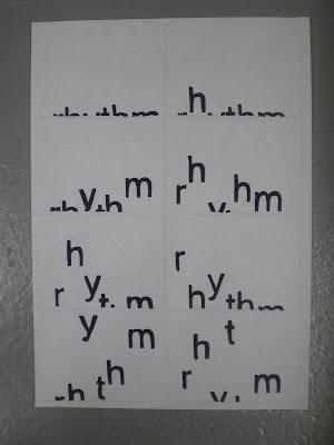
this is my final video I created from the story board I had to make a few changes to make the video work.
Saturday 27 December 2008
Friday 26 December 2008
Thursday 18 December 2008
Monday 15 December 2008
Better late than never!
I finaly found away to put on an video from the internet but not from you tube.
This is one of my favourite motion video from again
Renascent
there style is very fresh and sleek.
Its cleverly constructed together,with three screens
Title: Lost
Media: DVD
Client: » Chris Jones
Commissioned by: » Lovebytes
Misc: Minimal, Type in motion, for this Visual Poem to run over
3 plasma screens wide at the » Millennium Galleries in Sheffield.
Renascent
Only just discovered this company called Renascent which create amazing motion graphics.On there website they have a montage of all the work comerical and personal projects but but i cant find there video on you tube. but i have found a few other onces.
The best of there work is on there website
http://renascent.nl/motion.htm
but here a few a was able to find
Title: Nike In-Store 3D World
Media: Television/Video Wall
Client: » Nike
Commissioned by: » Postpanic
Misc: 3D Nike World created to function as transitions
between sport footage that was mastered by Postpanic.
Presented here is a personal edit of this World.
To see the full result please visit a Nike Store near you.
Sunday 14 December 2008
Saturday 6 December 2008
Magomed Dovjenko


I would like to know how the shine effect works weather its photographic or done on illustrator and photo shop or is it an mixture of both.But the effects well so the contrast s of works well it has a dark glossy effect.

It looks like the black and white version is pretty much the same illustration from the bottom typography "type". The mixture of colours work best more eye catching.

Tauba Auerbach
Friday 5 December 2008
Research ibet
I fond a graphic designer/typographer.Who's work is very distinctive and colourful. Its very beautiful and delicately made but does the word match with his illustration she he or she has created.

The image works really well.The fact that all of George Bush's issues with war,terrorism and money bursts out of the paper.

The contrast of colours work well with the brown,oranges and blues.Not sure what its about but maybe that's the whole idea is to be impressed by this work and go and fine out more what its about.

Its pretty but doesn't exactly fit to the subject.Even though its got Chinese simbles still doesnt work as it should.


This typography is very delicate, the black and white colours work well.Still though free tibet doesnt match the patterns around the typography.

The image works really well.The fact that all of George Bush's issues with war,terrorism and money bursts out of the paper.

The contrast of colours work well with the brown,oranges and blues.Not sure what its about but maybe that's the whole idea is to be impressed by this work and go and fine out more what its about.

Its pretty but doesn't exactly fit to the subject.Even though its got Chinese simbles still doesnt work as it should.


This typography is very delicate, the black and white colours work well.Still though free tibet doesnt match the patterns around the typography.
Thursday 4 December 2008
lesson
Wednesday 3 December 2008
Beautiful
this is an interview of John Lennon,they created an animation theres not much typography animation.but the images are amazing and works very well with the interview of john lennon works well of his personality.
this his is web address of the illustrations:
James Braithwaite
http://www.thebathwater.com/
this his is web address of the illustrations:
James Braithwaite
http://www.thebathwater.com/
Subscribe to:
Posts (Atom)


